I'm not map-obsessed, no. But I'm probably somewhere on the spectrum. I've been fascinated with maps as long as I can remember. When I was a kid, I bought a 33" x 47" print of Cayuga and Seneca Lakes here in the Finger Lakes. Was I a boater? Nah. I just really enjoyed the beauty of data superimposed over our natural world. There was something surreal about knowing that there are underwater cliffs, nooks and crannies hidden just out of sight. Sadly, that map was ruined many years later while sitting in a basement. Yep, it was water damage. Ironic.
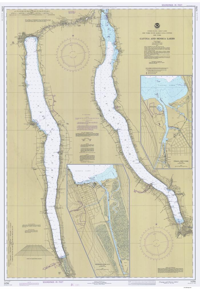
Cayuga and Seneca Lakes
I have another similar map in my office today. This one is nice and laminated, so has little chance of being similarly afflicted by water damage. It depicts the Erie Canal, and has two dimensions of data. First, it shows the Erie Canal's path through the heart of New York State. Then, along the top edge, it shows the elevation change of the canal at each longitude where a lock exists. I could look at these maps all day long, but I digress!

Erie Canal map
Strava, the fitness tracking app, recently made headlines after someone discovered some interesting data in an aggregated map they created in 2007.
The Strava Global Heatmap summarizes 1 billion activities and over 10 terabytes of raw input data to create amazing maps that show where people bike, run and swim all over the world. Trouble is, someone also noted that one could identify patterns of soldiers inside secure military facilities all over the world. A timely email arrived in my inbox a few days later from a local running group. The email contained a link to a story written in 2014 on flowingdata.com titled Where People Run in Major Cities. The author posted an R code snippet and talked about the ease with which you can create your own aggregated maps given a set of GPX files, which you can download from Strava (or Runkeeper, in his case). He summarized the process thusly:
Download your logs from whatever service you use, stick the R code in the same directory, run in the console, and you get a quick plot of your routes.
Wow. That sounds simple! I decided to give it a go. First up: what's R code? Some quick Googling revealed that R is a free software environment for statistical computing and graphics. This is on the periphery of my area of expertise (usability and front-end development) but I thought, "Hey, it's about computers, so I can do it!" I rolled up my sleeves and got started. The process took a lot longer than the quote above would imply, and your mileage may of course vary, but I got some cool maps in the end.
Get Your Strava GPX Data
Go to your Strava profile page (you must be signed in). At the bottom of the right column, you'll see a link to get your data. Click that, and Strava will send you an email when your archive is ready. Download and unzip that, and you'll have all of your GPX files in a single folder. I filtered mine so I had separate folders for running and biking.
Download the Map Routes Function
I saved the original author's R code in a gist for posterity. Save the file as map-routes.R in the same directory as your GPX files.
Download R
This was the tough part for me, mostly because the function requires a lot of dependencies for mapping. First, I downloaded R for Mac OS X from r.research.att.com. Since I'm running Mavericks, I've used R-3.3-branch-mavericks.pkg. For other OS, see the FAQs at cran.r-project.org/faqs.html.
Once you're installed R, you can open a Terminal, go to the directory where you've downloaded the GPX files, and type "r" to start R. Once in the R console, type source("map-routes.R") to run the script. Of course, I got some errors, and the chief complaint was the lack of plotKML. I needed to install some dependencies to continue!
I needed to download the binary for plotKML to install it, since it wasn't working directly from the Terminal for some unknown reason. I grabbed the right version of plotKML from cran.r-project.org and downloaded it. Once downloaded, this was the command to install it from the Terminal.
install.packages("/Users/Username/Downloads/plotKML", repos = NULL, type="source")Next it complained about not having RColorBrewer, scales, munsell, plyr ... the list went on! Long story short, you can use this command to install the dependencies. For me, it was a bit like peeling an onion, but soon I was done. Replace PACKAGE_NAME below with the name of the dependency plotKML is looking for.
install.packages("PACKAGE\_NAME", repos=c("https://cran.r-project.org"))To verify that plotKML is all installed properly, type library(plotKML) into the R console. You should see something like this:
plotKML version 0.5-8 (2017-05-12)
URL: http://plotkml.r-forge.r-project.org
Generate Your Maps
Now I was ready to make some maps! I started with my cycling routes folder and typed source("map-routes.R") to kick off the process. It took awhile, but soon it popped up with a window of my bike routes! From this window, you should be able to save it as a PDF.
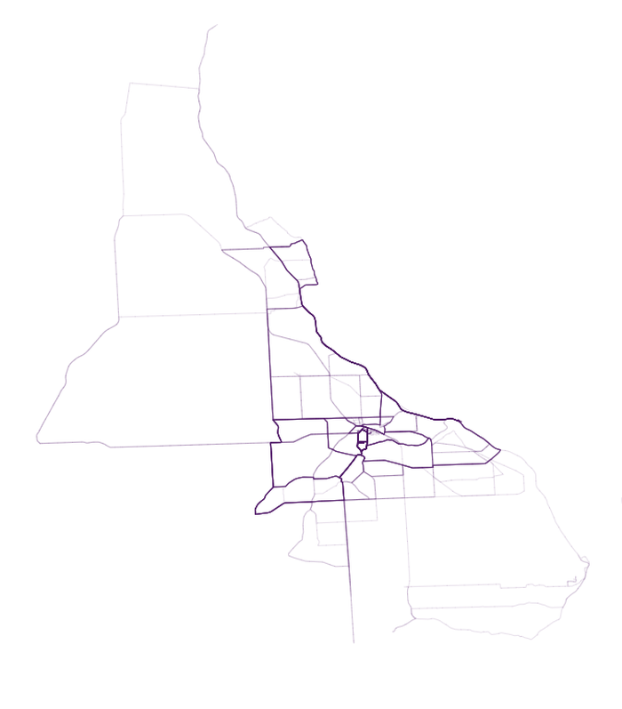
My bike routes after running the R script
Prettify
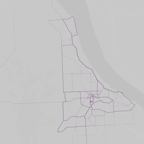
I wanted to overlay this on a real map, and so found some sites that offered different themes on top of Google Maps. I found one I liked and opened it in Affinity Designer. Turns out you can open the resulting PDF from the R code right in Affinity Designer and have access to the vector shapes. Very cool! I needed to stretch the vectors vertically and horizontally a bit to get it to perfectly match up with the Google map image, but once I got it, it lined up perfectly! Then I was able to export it to a PNG to include here.
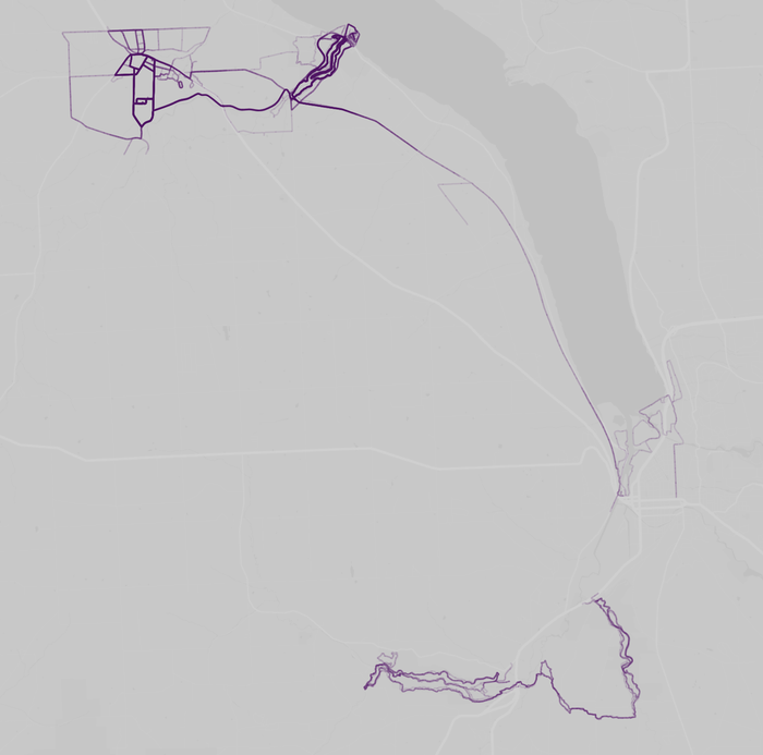
My most-local running routes
The area at top left lights up with the routes around my house in the 3-5 mile range, and near top center, the trails I frequent at Taughannock. There's a line on the Black Diamond trail that fades out as you approach Ithaca (I've only run end-to-end a few times). The lower right corner is Treman and Buttermilk State Parks in Ithaca, home to the Cayuga Trails 50 race I did.

My biking routes
The biking routes extend out farther, of course. The top loop near the lakeshore is our Sheldrake ride, one of the features of the Cayuga Lake Triathlon course. Route 89 is a pretty clear track from all the training we've done there!
Summary
I'm sure there are better ways to do it. If you've done this before and were able to streamline the process, let me know! In the course of talking about this project, my friend Adam Engst told me about madewithsisu.com, a service that'll take your Strava data and do some visualizations of it. It's not nearly as computationally intensive as this, since it only shows a handful of individual tracks, or start/end times, but cool nonetheless.

