I've been reading up on responsive design using media queries, and spent some weekend time applying the principles to this site. It wasn't that difficult - the most vexing problems for me came during the testing phase (more below). All in all, a great success, and an experience I can start to leverage for other web sites.
Learning About Responsive Design
There are a ton of resources out there, but here are a few that I found most helpful.
- I read about a lot of approaches in Smashing Magazine's articles on responsive design. I found the breadth of approaches really helpful to selecting one for my site.
- Ben Callahan's post How Should We Write Media Queries post was really helpful to me. I used his structure for the project, which calls for a base CSS file (which contains print styles in a media query), then a separate CSS file for the other media queries (not print, braille, embossed, speech, tty), and lastly a conditional comment for older versions of IE, since they don't support media queries.
- During testing, I found a problem with landscape iPad browsers (both Chrome and Safari) keeping the device-width the same width as portrait view. Gary Bacon wrote about a solution at Viewport Bug in Mobile Safari on iPhone and iPad, and it solved this problem for me. Many thanks!
The Process
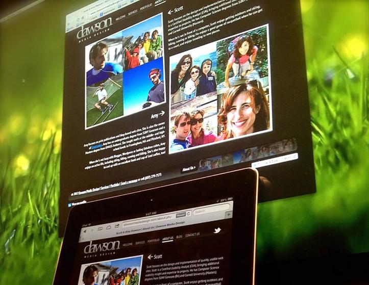
I approached this not from a device perspective, but from a layout perspective. My site is coded for a maximum width of 975 pixels, centered, so my initial media query breakpoint was to have that scale proportionally for narrower widths, down the point where the navigation bar would no longer have room for all of the options (right around 63.75em). In addition to scaling elements down, I also dropped a graphic element from the footer.
Then, I had another break point at 46em for narrower devices like iPhone, where the navigation is simplified even more, with links centered below the logo, and the footer dramatically simplified.
Lastly, I spent a few minutes with print styles, which are in a media query in the main CSS. I tested out the changes with Safari, Firefox and Chrome on the Mac, Safari and Chrome on iPhone and iPad, and IE 7, Firefox and Chrome on Windows XP. I'm pretty satisfied with the result, although I did come across a pesky issue with Google Fonts not rendering on iPhone's Chrome (Safari works fine). If anyone has an idea for why that's failing, let me know!
Related Posts
There are 7 other posts like this one. Here are some other recent ones:
 A Month of Drawing: Inktober 2017November 1, 2017 – When I saw people start posting with the #inktober tag on October 1, I thought, "Why not?"
- Reflections on Resilient Web DesignJanuary 28, 2017 – If you are tenured professional or somebody just getting started off with web design or development, a little context can go a long way.
- #365DayDraw: Challenge CompletedDecember 31, 2016 – With a stroke of my flair pen this morning, it was done. Since 2016 was a leap year, I churned out 366 days of drawings.