Beveled corners
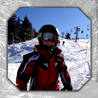
I had a recent need for beveled corners with superimposed images, and wanted to accomplish the effect with as little manipulation of the images as possible. Sadly, I was unable to find anything that fit the bill, but did learn about three different ways of accomplishing beveled corners, each with pros and cons. The effect I was going for was an image over an image background, where the foreground image has beveled corners. Like the composition at right (done in Photoshop). I didn't find what I was looking for, and ended up doing something different, but what I learned is still post-worthy.
Below, I have three sample implementations to show the same effect using jQuery Corner, CSS Borders and CSS3 Gradients. Each has their pros and cons, listed below the code samples.
jQuery Corner
CSS Borders
CSS3 Gradients
In Summary
- jQuery Corner plug-in Pros: simple to implement; Cons: reliance on jQuery (is that really a con, though?), and you have to have a solid background (a deal-breaker for this job).
- CSS Borders Pros: probably the most cross-browser compliant of the bunch; Cons: Interior image cannot full bleed fully to the bevel edge, plus unnecessary markup. You'll need to position your content absolutely if you want to have it bleed into the beveled edge.
- CSS3 Gradients (adapted from Lea Verou's post on the topic) Pros: simplified markup, but must be a solid interior color (can't use an interior image); Cons: depending on the browser, you sometimes get an interior vertical line where the gradients match up.
The bottom line ... if you have need to (a) bevel a solid color box over a background image, CSS Borders and CSS3 Gradients are good choices. If you need to (b) bevel a box with an image over a solid background color, jQuery Corner is a great choice. If you need to do both, however (box with an image over an image background), you'll probably need to break out Photoshop. Maybe there will be a time soon where a W3C specification allows for client-side image masking ...
