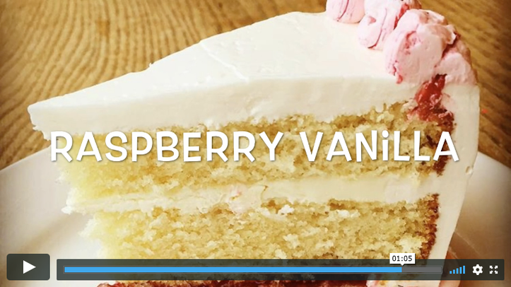

When you embed a Vimeo video on a Wordpress web site by using a short code, there's only an option to pass in a static width and height. In this responsive world, I tried this out using 100% as the width, but that didn't work. My wife's emoticakes.com Wordpress site had a video that looked great, but on mobile the video's fixed width blew it out of the content area, rendering the text around it incredibly small.
My solution uses CSS as a workaround. This snippet of code, if you add it to your Wordpress theme's CSS, will make the video scale to a maximum of the container's width. Further, since the video letterboxes if the aspect ratio doesn't match the video player's dimensions, it sets a maximum height if the viewport is less than 600 pixels wide. The result, shown at right, is oh-so-sweet.
Related Posts
There are 23 other posts like this one. Here are some other recent ones:
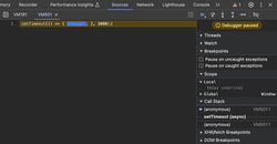
 How to Inspect Hovered Elements (Menus, Tooltips, and Dialogs, Oh My)July 1, 2024 – I found this technique useful for debugging CSS inside ephemeral DOM elements.
- How to Automatically Create Google Calendar Events from a Google SheetFebruary 12, 2023 – If you need to automatically create Google Calendar events from data in a Google Sheet, this pared-down example should work well for you.
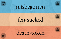
- Shakespeare Insult GeneratorOctober 10, 2021 – I created this Shakespeare Insult Generator: it converts three arrays of adjectives and nouns into a delightful random insult that would have thrilled the Bard himself.